Showing posts with label Technique.. Show all posts

Saturday, September 27, 2014

Water Color Technique - Wet on Wet

Wet Watercolor onto wet paper

I took a class this month at my LSS and played with watercolors.  You never know what you'll get playing around.  Here's what Susan, our instructor, had to say about it.  "Brush paper with clean water.  Paint directly on to stamp with watercolors.  Stamp on to wet paper".  Now isn't that easy?  While the image is still wet, you paint with the background color (blue here).  It's easy to move the blue into the spaces between your painted flower.   When the watercolor has dried, you can stamp on top of your paper.  I used an open fence type stamp on the right and part of a "writing background" stamp on the left.  You can finish as you wish with your card.

NOTE:  I added some yellow, brown and orange to my original stamped image to bring out more color.

I hope you enjoyed my little watercolor here.  I'm in no way thinking I'm a grand painter, but I'm certainly working at having fun!

Arlene and the Die Cut Divas

Tuesday, September 16, 2014

Quick Watercolor Technique Wet Watercolor on Dry Paper

I took a class on watercolor techniques at my local stamp shop, The Stamp Art Shoppe, in Roseville, California.  Susan, our teacher, also conducts Copic coloring classes.

Here is an easy peasy card because it is easy to make your colors go where you want them to.   Yes, this was no accident.  hehehe  If your paper is dry, your watercolors won't run out of control as much as a wet on wet technique.  Just a tip.  As Susn says, "it is easier to contain the color where you put it".  You put your wet media (watercolors blue and green) on the paper and tilt the paper so you get the drips and runs where you want them.  Now I wanted purple after I had the blue and green on, so that's what I did.  I added the purple, tilted the card and let it run.  I really liked the addition of a third color.  Let it dry and then stamp a large stamp to give it some cohesion.  A ribbon here added some interest.

I didn't get the image stamped well here, but if I didn't tell you, you wouldn't have known it.  The happenstance of art!

I really do like the way this turned out.

Monday, September 8, 2014

The Color Wheel Technique

Arlene has a great technique here with these two cards, using a color wheel to combine coordinating colors. 
 in her own words;
Another technique for me.  This Technique in using the color wheel is choosing analogous colors with one complement.  I used three analogous colors on this card, consisting of Yellow, Yellow-Green and Green.  I then used the complementary color of Green, which is Red.

I used three colors next to each other on the color wheel.   Taking a section from Dina Wakely's handout practice sheets, "These colors harmonize well and even blend into each other.  The effect is similar to a monochromatic scheme, but with more visual interest.  The gradual changing of the colors is pleasing and suggests form and depth". Another practice handout contained boxes again for practice using analogous with complement.  That's the technique I used here.

Analogous with Complement.  Analogous is 2 to 3 colors next to each other on the color wheel.  You add a color that is complementary to the middle color or actually to whichever color looks best of the paint you're using, but usually the middle color.  A Dina Wakely moment please:  "This scheme gives you the harmony of the analogous scheme, and a bit of pop from the complement."  I think it works!
I hope the color wheels below are helpful.  The two circles directly below are from worqx.com
complementary colors - red and greenComplementary Colors: Those colors located opposite each other on a color wheel.

analogous colorsAnalogous Colors: Those colors located close together on a color wheel
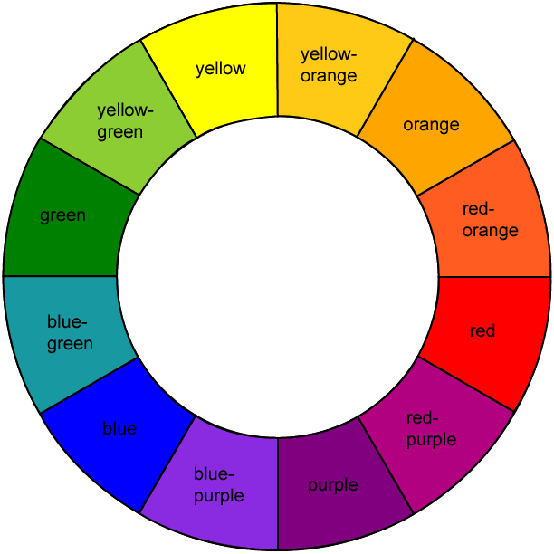
The wheel below I found by googling "color wheel" right here
Thanks Arlene I love this idea don't know I never thought of this when I'm stuck and don't know what colors to use.
Hannah and the DCD Team

Friday, January 3, 2014

Case This, Case That!

Hero Arts is our sponsor to start off the new year.  A big thank you to Hero Arts.

Preview


If you read my January 1st "A Bit of This and That" post, you know Jennifer McGuire has inspired me and I cased her technique of triple stamping a background.  Here I am double-stamping a background just to create another great background.  I am casing her card once again stamping the background twice, using distress inks China Blue and Faded Jeans.
I really hadn't expected much from this Hero Arts Zig Zag background stamp, but I'm loving the pattern.  I know, ye of little faith.... 

Close-up of this delightful butterfly, part of the clear set Butterfly and Flower (CL750).  It sparkles!

                    This makes a wonderful Thank you card.                          

The longer panel is a beautiful pattern and a little sentiment & embellishment is all you need.

Be sure to enter our January challenge 
"Make it Glitter".
Arlene and the Die Cut Divas